
Getting to the heart of the brief
The festival brings together rescue professionals from across the country to share skills, demonstrate their expertise and learn from one another. The identity needed to capture that energy, acknowledge its Essex home and work across digital communications, printed materials, signage, merchandise and medals.
Giving the event its own character
This was an opportunity to explore a more expressive direction beyond Essex Fire’s everyday communications. I drew on the angular shapes within its branding, using geometric forms to suggest movement, coordination and signalling. The aim was to give the festival its own personality while keeping a recognisable connection to the host service.
Bringing the identities together
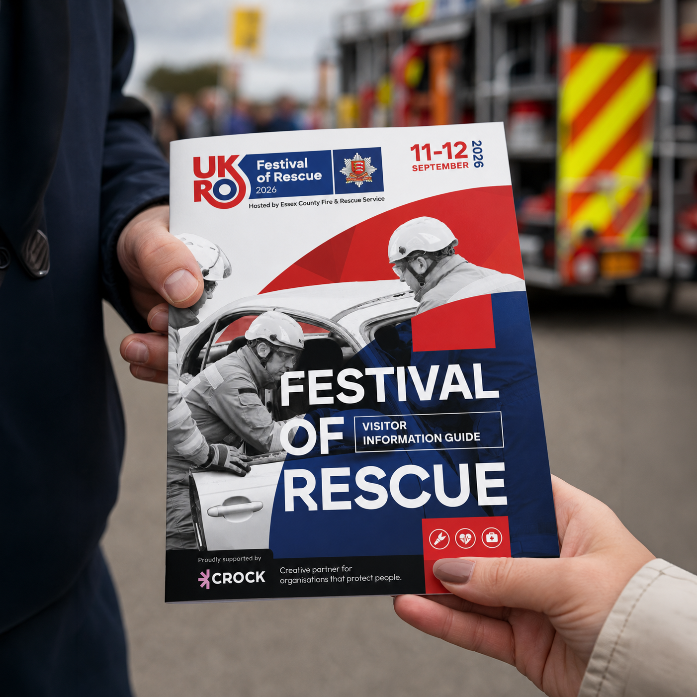
I developed a clear logo lock-up that brought the festival identity together with the existing UKRO branding and Essex Fire crest. Each had its own role, recognising the national organisation and host service while giving the event a distinctive presence.
Turning the identity into a visitor guide
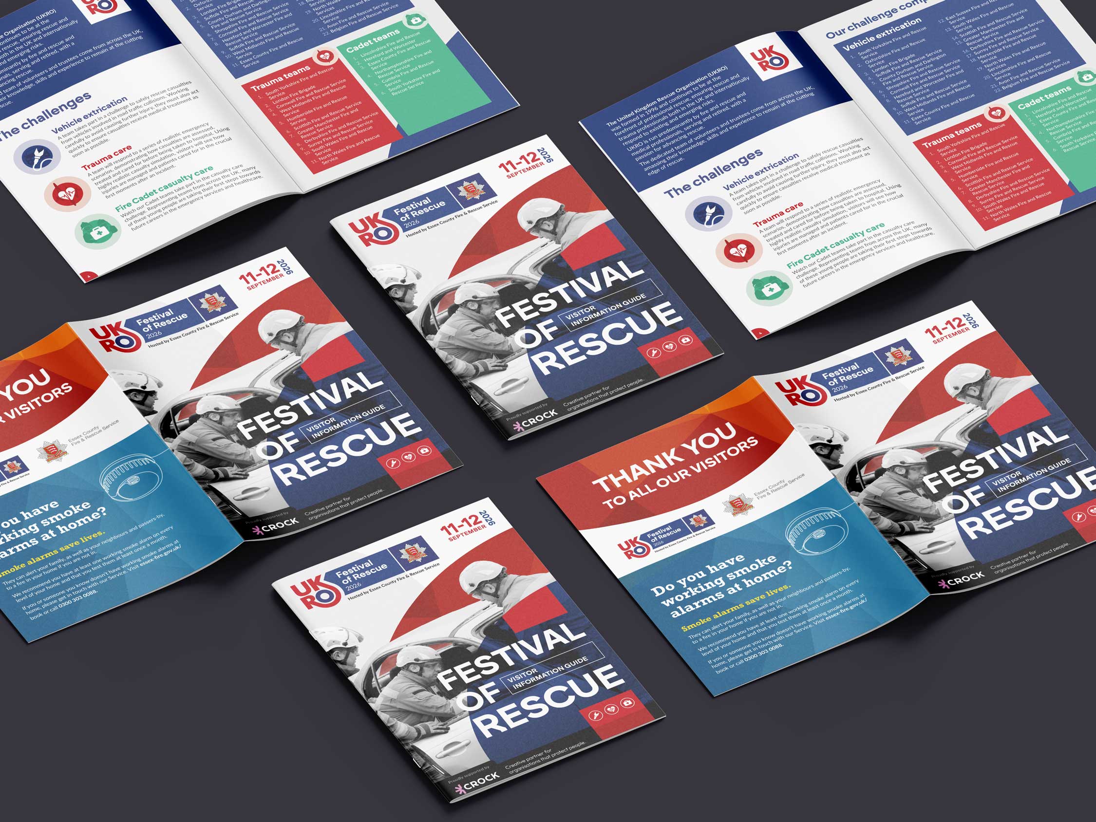
I carried the visual approach into the brochure, combining bold red and navy graphics with rescue photography, clear typography and illustrations for the different challenges. Clear sections and a consistent hierarchy organised team listings, venue details, safety guidance and sponsor profiles, balancing the excitement of the event with practical information.
Giving something back
Through my ongoing relationship with Essex Fire, I chose to sponsor the event with my creative support. I enjoy working with people and organisations that make a difference, and this was an opportunity to contribute my skills to an event centred on the people who protect and support others. That community connection made the project particularly rewarding.
“At Essex Fire, we understand the importance of a strong and consistent brand. As a public sector organisation, our model means we don’t have an in-house design and brand manager, so having the right creative partner is really important to us.
We work with Crock Design as an extension of our team. They understand our organisation, our brand and what we’re trying to achieve, and turn our ideas into professional, engaging and high-quality designs.
For UKRO 2026, Crock Design have worked with us to develop the event logo and create this programme, helping us bring together the UKRO identity with Essex Fire’s brand. They’ve taken our ideas and turned them into something that feels professional, distinctive and right for such an important event.
They’ve been a great creative partner throughout, and we’re really proud of what we’ve created together.”
ECFRS Director