Starting with a conversation
The owners came with an open mind and a few possible names, drawing on Greek and Egyptian mythology. There was no fixed visual direction, so our discovery call focused on what they wanted the gym to stand for, who it needed to appeal to and how the brand might live beyond the training space. That gave us a starting point for a brief: a bold, modern identity that could balance the intensity of CrossFit with a sense of belonging.
Finding meaning in the name
I researched the fitness market, CrossFit and the mythology behind the naming options. Together, we settled on Atlas. The Greek Titan, condemned to carry the heavens, gave us a powerful reference for endurance and strength. But the most interesting opportunity was to turn the story towards community. Where Atlas carries his burden alone, this gym could stand for people building the strength to face challenges together.
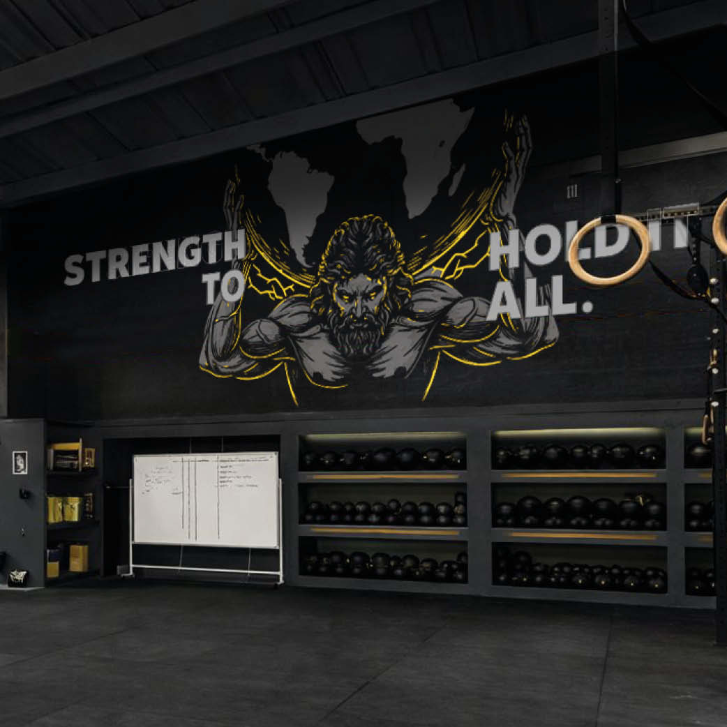
Strength to Hold It All
I developed the strapline to bring that idea into a few simple words. It speaks to lifting weights and getting fitter, but also to the mental resilience that comes from showing up, finding support and working through challenges. The brand purpose, “to empower people to carry more, together”, gave that thinking a clear foundation. It helped us define the kind of community the gym wanted to build and the feeling the identity needed to create.
Turning the idea into a mark
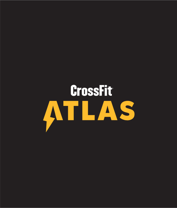
From early sketches, I explored ways to give Atlas a distinctive symbol. The strongest direction combined the A with a lightning bolt, bringing a sense of structure and stability together with energy and movement. Bold typography gave the name a powerful presence, while horizontal and stacked lockups allowed it to sit alongside the CrossFit wordmark. The standalone mark gave the brand a recognisable shorthand for smaller spaces, social profiles and apparel.
Building the wider identity
Black and grey created a strong, versatile foundation, with Bolt Gold adding contrast and energy. The bright yellow accent connected the palette to the lightning bolt and gave the identity a distinctive presence across different formats. I explored how the brand could work on T-shirts, bottles and social media, creating a consistent visual language that members could recognise inside and outside the gym.
Giving the gym a focal point
A large wall offered an opportunity to bring the story into the training space. I developed a mural concept combining a mythological figure, lightning details and oversized “Strength to Hold It All” typography. Shown in context alongside the other applications, it helped the owners picture how the identity could shape the atmosphere of the gym and give the community something to rally around.
Putting my CROCK process into practice
This project shows how my CROCK process connects the first conversation with the finished creative work. Discovery and research helped establish the direction; the name, purpose and strapline gave it meaning; and sketching, development and application turned it into a practical identity. I brought that thinking together in a brand presentation covering the introduction, mission, purpose, brief, logo concept, lockups, colour palette and mockups. It gave the owners a clear explanation of the decisions behind the work and a shared reference for taking the brand forward.
Explore the CrossFit Atlas brand presentation (PDF)
See how the strategy, identity and applications came together, and the depth of thinking behind a complete brand package.