Confidentiality: The project name and imagery have been adapted to protect commercially sensitive information.
Getting to the heart of the brief
The opportunity had a strong story behind it: a waterfront site shaped by maritime and industrial heritage, with a vision for a more connected, sustainable and vibrant future. The challenge was to give that story a recognisable personality and make the identity work across a complex, information-heavy bid. Before opening Illustrator, I worked through what the team needed to communicate, who they needed to reach and how the brand would need to perform across documents, presentations and the wider bid.
Starting with the place
I researched the site’s history, dockside character and future ambitions, looking for ideas that could give the visual direction a real sense of belonging. Water, industry, movement, nature and community kept emerging. Rather than reaching for a familiar construction aesthetic, I wanted the identity to feel connected to this particular place, while still expressing the energy of what it could become.
Finding the idea together
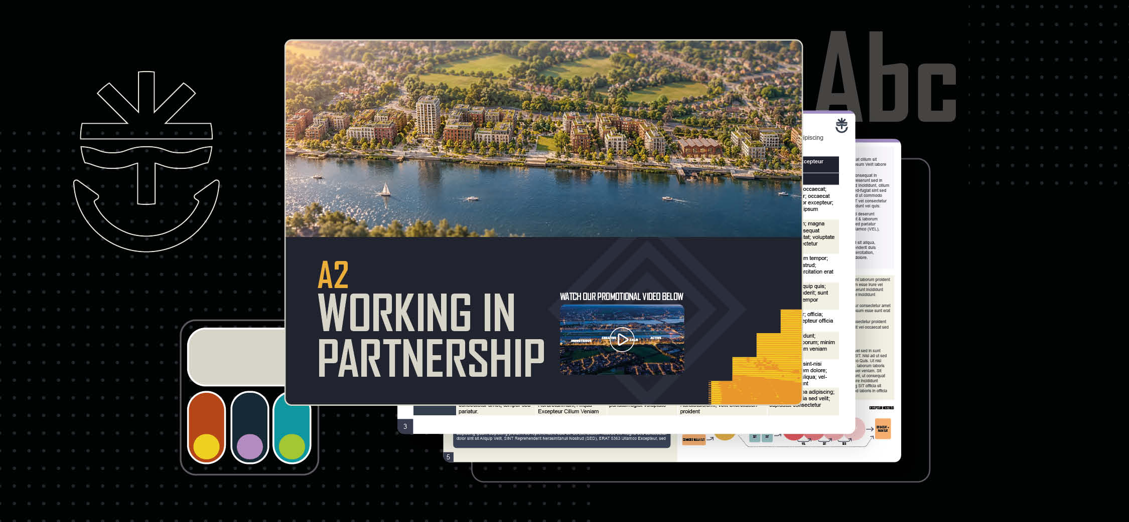
Working closely with the architects and wider bid team, I translated that research into concepts and presented routes for discussion. Their architectural vision and feedback helped shape the direction as it developed, so the brand and the project felt aligned from the outset. The final mark brings together three simple ideas: an anchor for maritime heritage, a spark for innovation and ripples for water and dockside life. Together, they create a symbol that looks back to the site’s past while pointing towards its future.
Building a visual language
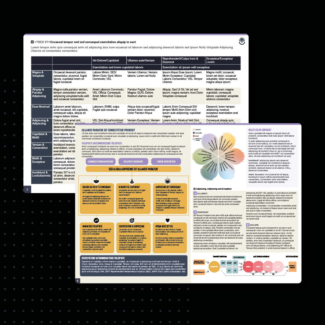
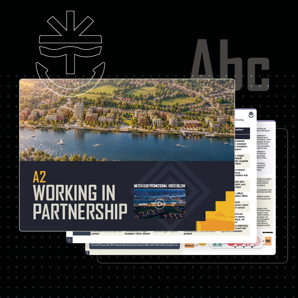
The mark became the starting point for a wider identity. Industrial-inspired typography references dockside signage, angled graphic forms take cues from the site’s infrastructure and a family of icons gives themes such as nature, connectivity, growth and community their own visual shorthand. Colour, type, imagery and layout worked together as a flexible system, giving the team a consistent way to tell the story across everything from a presentation slide to a detailed bid spread.
Making it work under pressure
The identity was rolled out across three major bid documents, from SQ through to ISFT, as well as presentations and supporting material. Each submission brought hundreds of pages, multiple contributors, changing content, strict page limits and tight deadlines. I built organised InDesign documents with clear styles, grids and repeatable components, so pages could adapt without losing consistency. I also trained team members to use Adobe Acrobat comments to mark up changes directly on the artwork. That made feedback clearer and text updates quicker, helping the team keep the submission moving right through to final tender.