Clean, simple exhibition and conference brochure design for Critical Communications MENA.
I designed this eight page brochure whilst working at Intuitive Design in 2016. This was one of many brochures I designed on a set of brand guidelines that Informa Telcoms introduced to bring all of their events together under one brand.
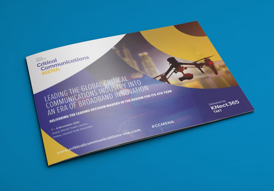
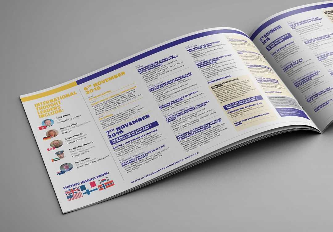
Each event had a set of shapes and a secondary pattern to work with. For example this events shape was circles and the secondary pattern was dots. Each event had a colour pallet to work with to distinguish the event type and region.
These guidelines gave enough freedom for us designers to make the event individual. But by keeping the overall style, fonts and colour pallets across all their events created a strong recognisable brand. This is a prime example of how guidelines can be used freely and not restrict creativity but influence it.