The Project
Simply, the brief was to design some cool restaurant branding for a new restaurant based in Essex. The target audience was anyone and everyone who loved good food and a trendy casual atmosphere. The brand needed the ability to expand into other areas so needed to be localised. It needed to appeal to those visiting in the day which was more of a casual cafe environment to those eating in the evening for a more social meal with a few drinks. Overall it was a very open enjoyable brief.

The Design
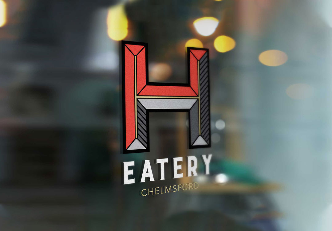
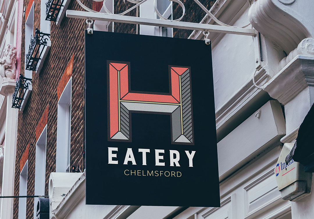
The signage (pictured above) was the first place the logo was viewed. Being placed down a side street I wanted the logo to be bright and stand out from other restaurants offering something a little different. The main focus was the ‘H’ which was designed with very sharp geometric angles. Standing out on the exterior of the restaurant but also being able to be used on more intricate detailing such as the embossed stationary below. Coral pink (with a touch of orange to tone it down) and gold were used to create a luxury, modern palette. I also created a brighter colour range for the cocktail nights the restaurant hosted for their social media advertising.
All the images you see are mock ups for the client and when the project goes ahead the brand will carry on throughout the restaurant. This will be implemented by either creating brand guidelines or me continuing the work.